Load dataset
Let’s load the wine dataset to demonstrate the plots.
# Load library
from sklearn.datasets import load_wine
# Load dataset
data = load_wine()
X = data.data
y = data.target
labels = data.feature_names

from pca import pca
# Initialize
model = pca(normalize=True)

# Fit transform and include the column labels and row labels
results = model.fit_transform(X, col_labels=labels, row_labels=y)

# [pca] >Normalizing input data per feature (zero mean and unit variance)..
# [pca] >The PCA reduction is performed to capture [95.0%] explained variance using the [13] columns of the input data.
# [pca] >Fitting using PCA..
# [pca] >Computing loadings and PCs..
# [pca] >Computing explained variance..
# [pca] >Number of components is [10] that covers the [95.00%] explained variance.
# [pca] >The PCA reduction is performed on the [13] columns of the input dataframe.
# [pca] >Fitting using PCA..
# [pca] >Computing loadings and PCs..
# [pca] >Outlier detection using Hotelling T2 test with alpha=[0.05] and n_components=[10]
# [pca] >Outlier detection using SPE/DmodX with n_std=[2]
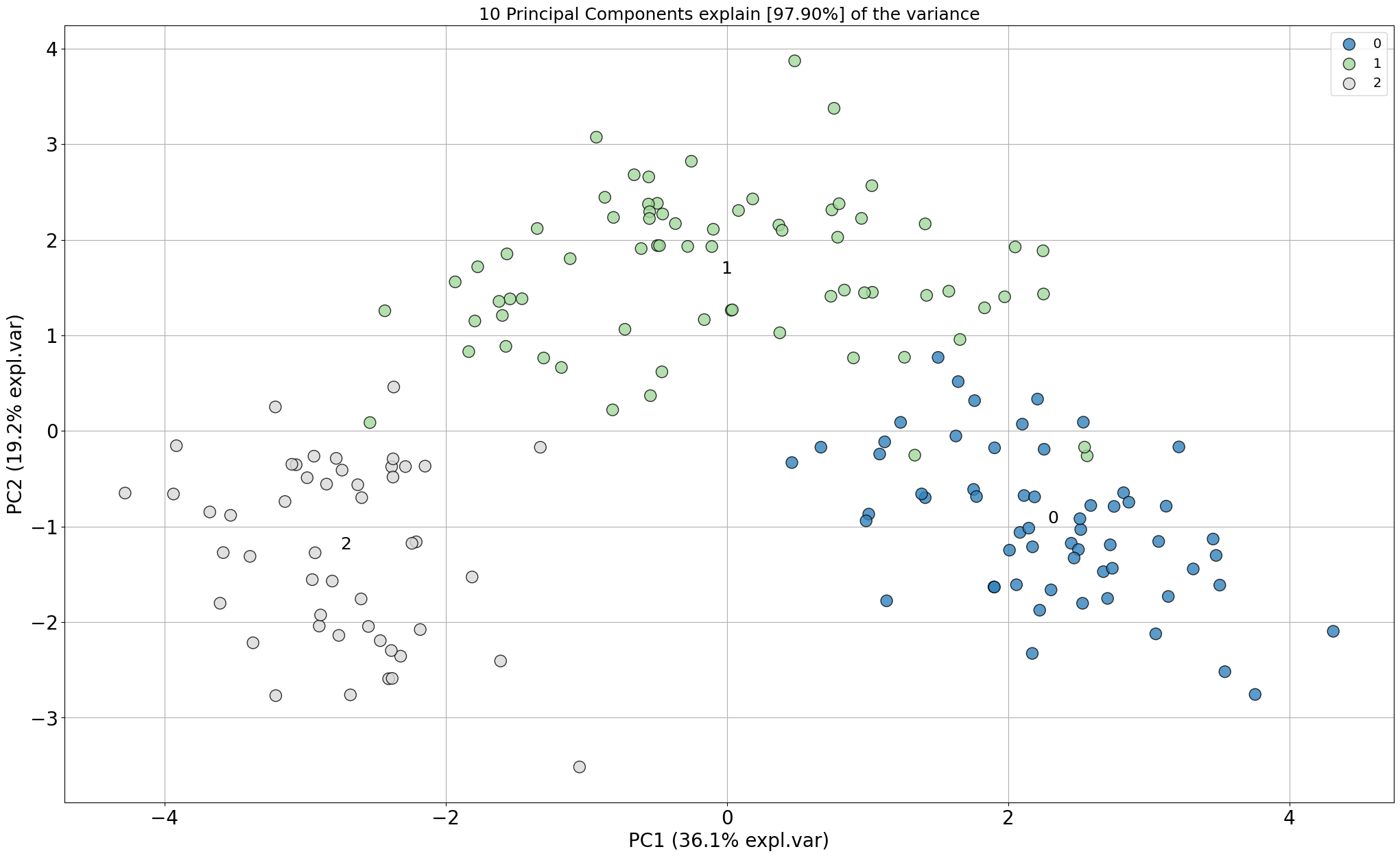
Scatter plot
# Make scatterplot
model.scatter()
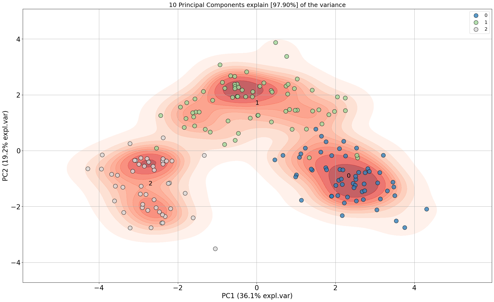
# Make scatterplot
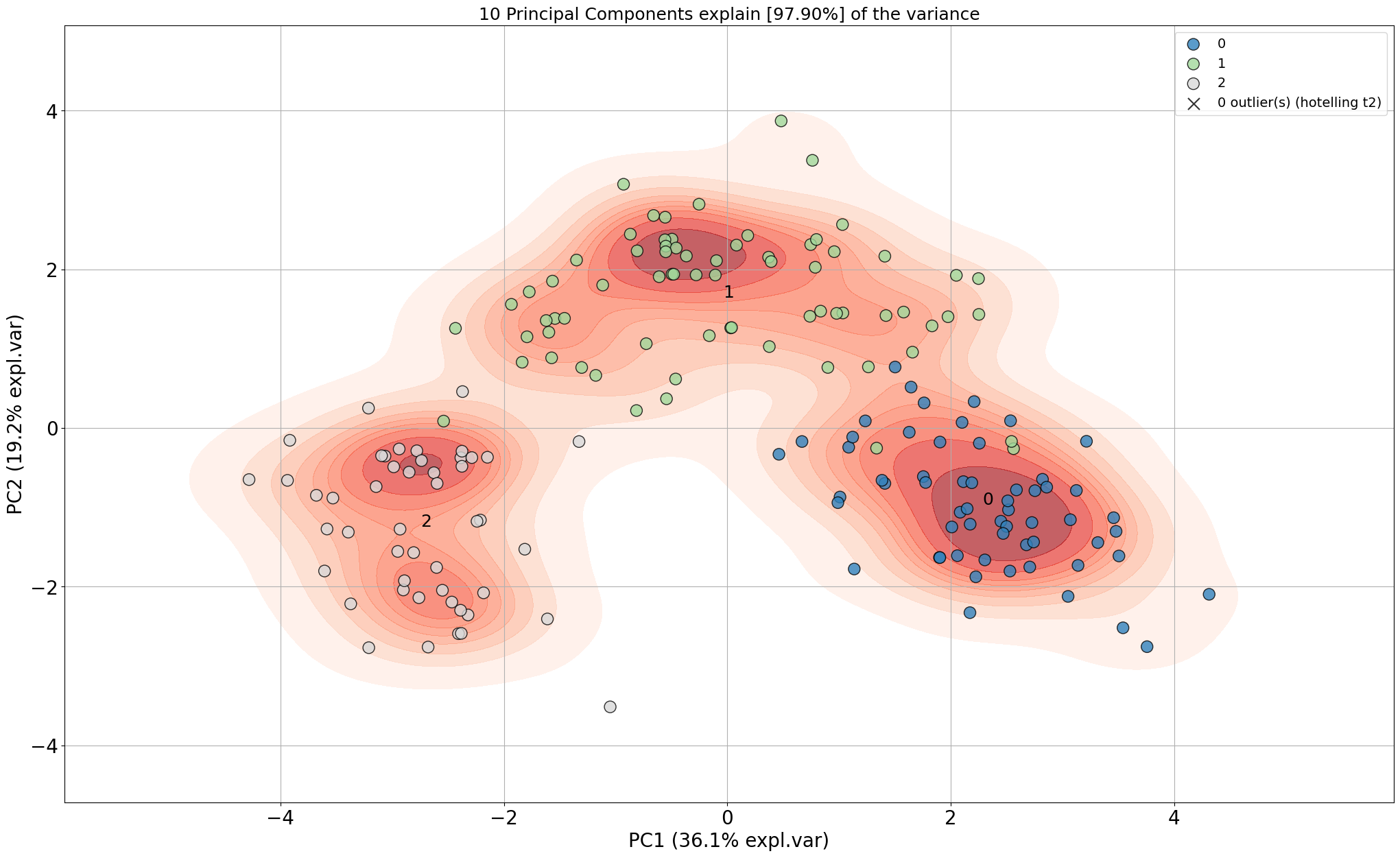
model.scatter(density=True)
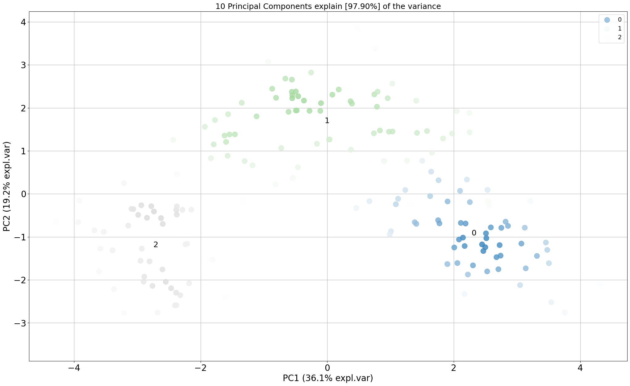
# Gradient over the samples. High dense areas will be more colourful.
model.scatter(gradient='#FFFFFF', edgecolor=None)
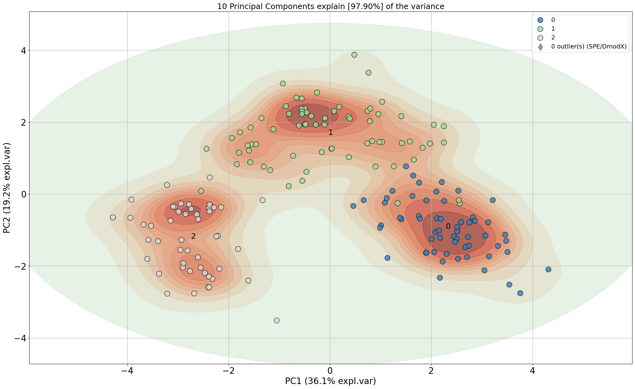
# Include the outlier detection
model.scatter(SPE=True, density=True)
# Include the outlier detection
model.scatter(HT2=True, density=True)
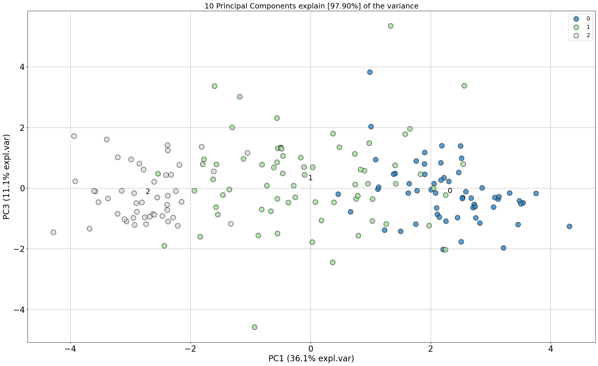
# Look at different PCs: 1st PC=1 vs PC=3
model.scatter(PC=[0, 2])
|
|
|
|
|
|
|
|
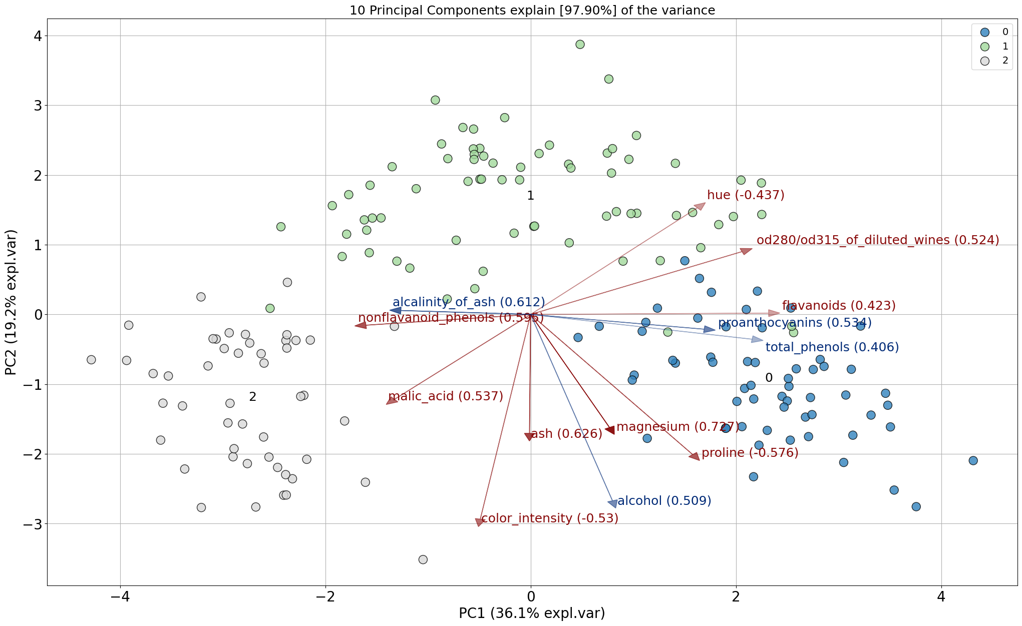
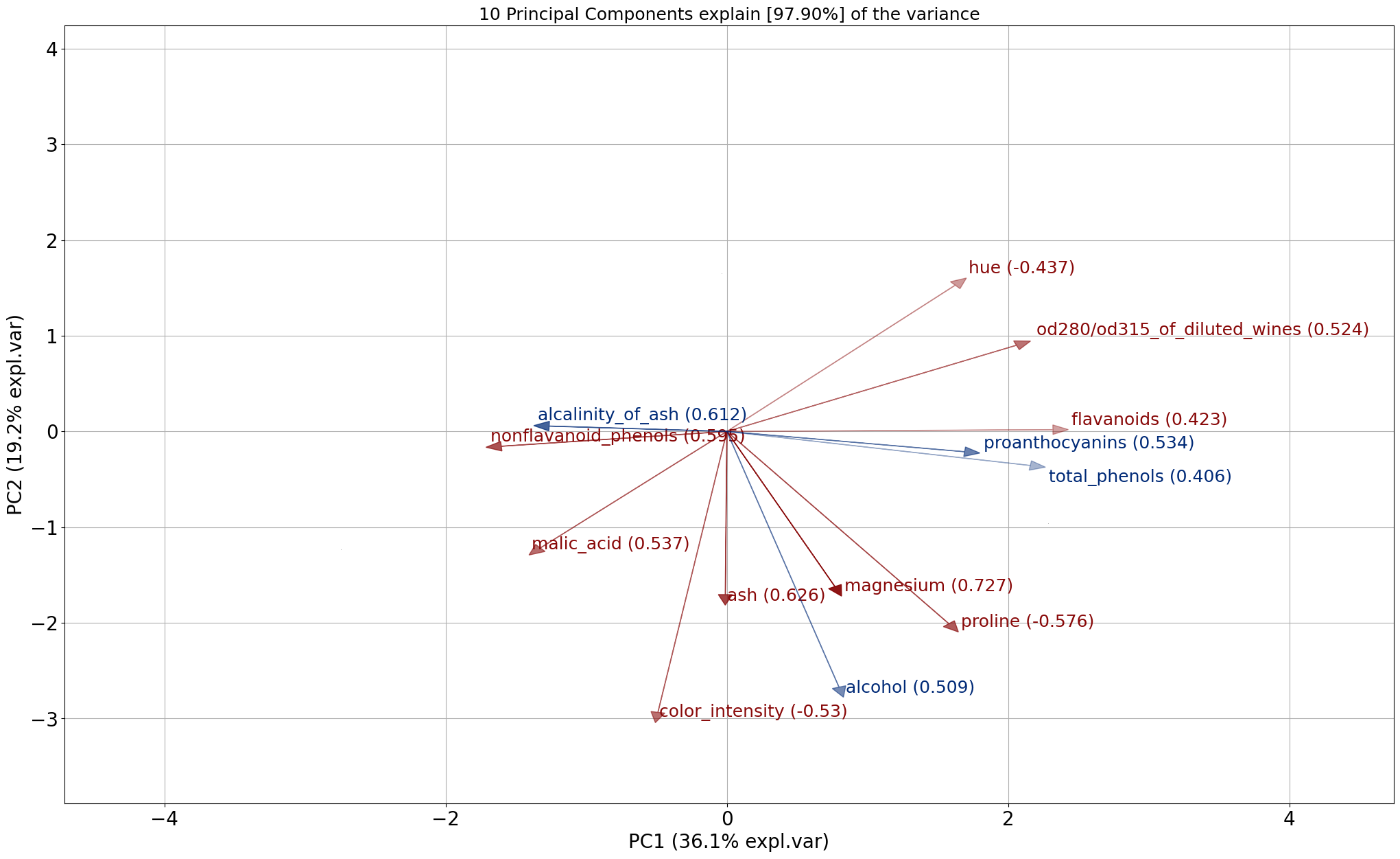
Biplot
The biplot draws the loadings (arrows) together with the samples (scatterplot). The loadings can be colored red and blue which indicates the strength of the particular feature in the PC.
For each principal component (PC), the feature is determined with the largest absolute loading. This indicates which feature contributes the most to each PC and can occur in multiple PCs. The highest loading values for the features are colored red in the biplot and described as “best” in the output dataframe. The features that were not seen with highest loadings for any PC are considered weaker features, and are colored blue the biplot. In the output dataframe these features are described as “weak”.
# Make biplot
model.biplot()
# Here again, many other options can be turned on and off
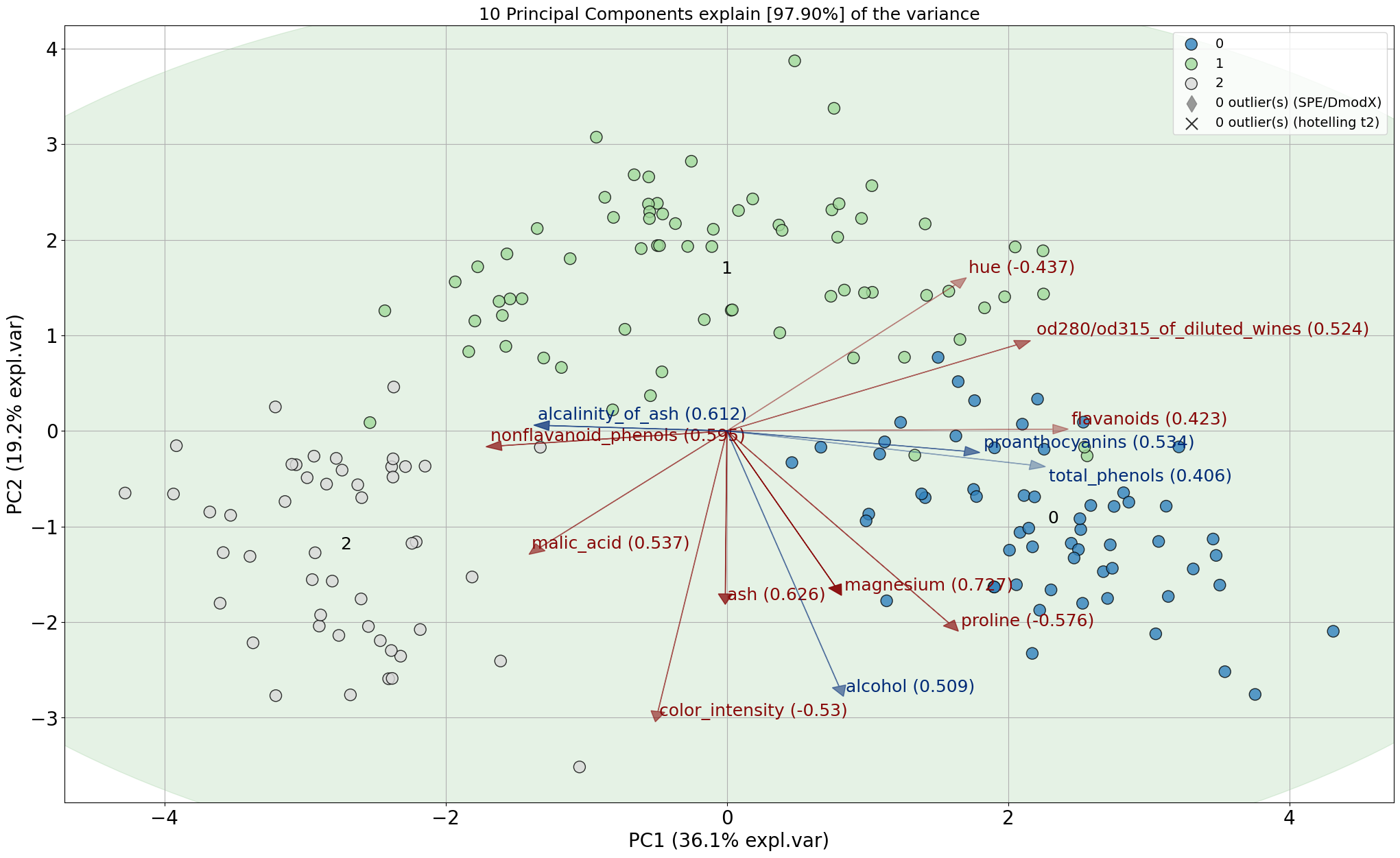
model.biplot(SPE=True, HT2=True, legend=1)
# Show the top features
results['topfeat']
# PC feature loading type
# 0 PC1 flavanoids 0.422934 best
# 1 PC2 color_intensity 0.529996 best
# 2 PC3 ash 0.626224 best
# 3 PC4 malic_acid 0.536890 best
# 4 PC5 magnesium 0.727049 best
# 5 PC6 malic_acid 0.536814 best
# 6 PC7 nonflavanoid_phenols 0.595447 best
# 7 PC8 hue 0.436624 best
# 8 PC9 proline 0.575786 best
# 9 PC10 od280/od315_of_diluted_wines 0.523706 best
# 10 PC9 alcohol -0.508619 weak
# 11 PC3 alcalinity_of_ash 0.612080 weak
# 12 PC8 total_phenols -0.405934 weak
# 13 PC6 proanthocyanins -0.533795 weak
|
|
Biplot (only arrows)
# Make plot with parameters: set cmap to None and label and legend to False. Only directions will be plotted.
model.biplot(cmap=None, legend=False)
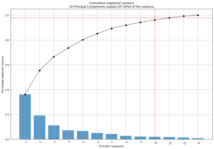
Explained variance plot
model.plot()
Alpha Transparency
fig, ax = model.scatter(alpha=1)
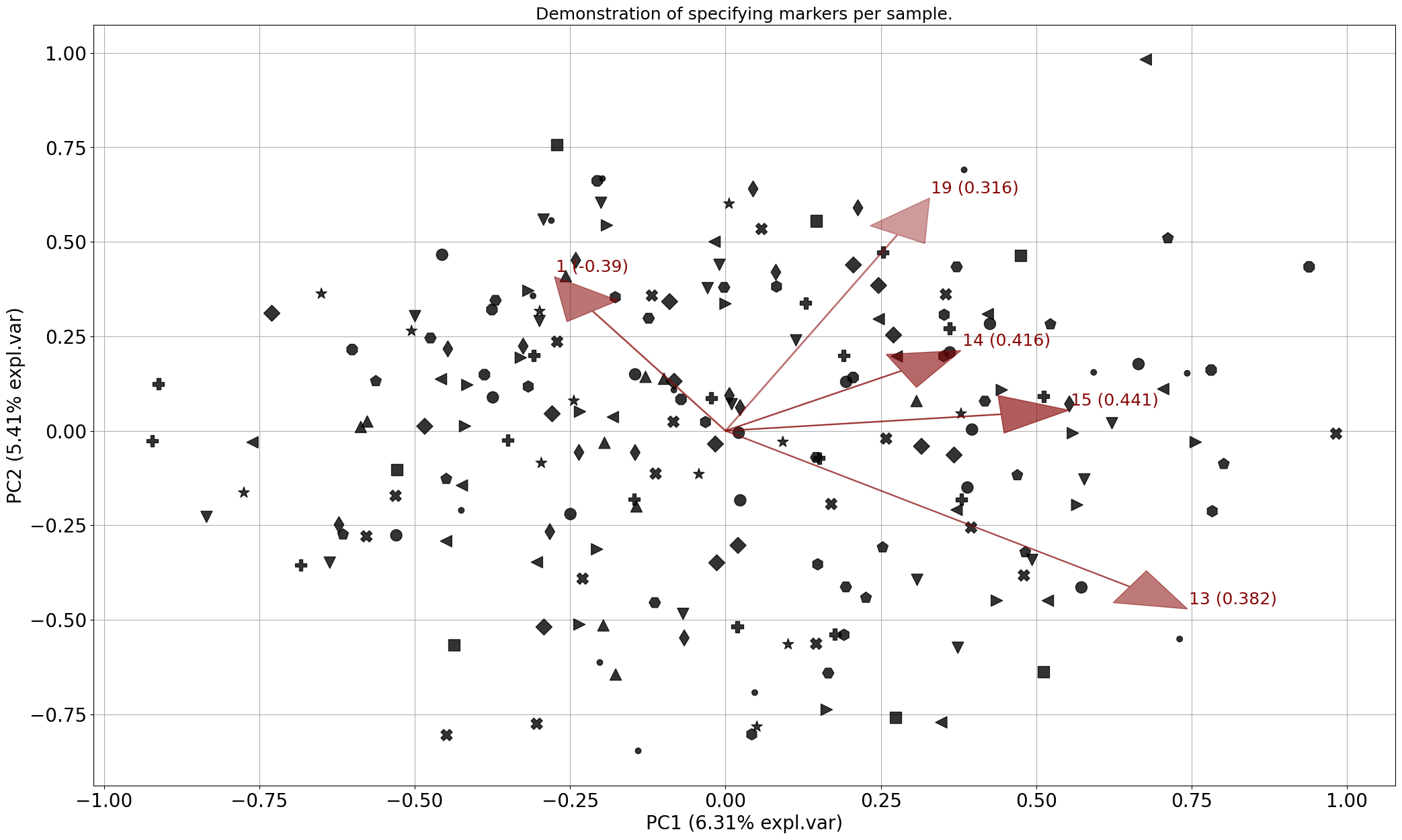
Markers
import numpy as np
from sklearn.datasets import make_friedman1
from pca import pca

# Make data set
X, _ = make_friedman1(n_samples=200, n_features=30, random_state=0)

# All available markers
markers = np.array(['.', 'o', 'v', '^', '<', '>', '8', 's', 'p', '*', 'h', 'H', 'D', 'd', 'P', 'X'])
# Generate random integers
random_integers = np.random.randint(0, len(markers), size=X.shape[0])
# Draw markers
marker = markers[random_integers]

# Init
model = pca(verbose=3)
# Fit
model.fit_transform(X)
# Make plot with markers
fig, ax = model.biplot(c=[0, 0, 0],
                       marker=marker,
                       title='Demonstration of specifying markers per sample.',
                       n_feat=5,
                       legend=False)
|
Control color/marker/size per sample
import numpy as np
import matplotlib.pyplot as plt
import matplotlib.colors as mcolors
from sklearn.datasets import make_friedman1
from pca import pca

# Make data set
X, _ = make_friedman1(n_samples=200, n_features=30, random_state=0)

# All available markers
markers = np.array(['.', 'o', 'v', '^', '<', '>', '8', 's', 'p', '*', 'h', 'H', 'D', 'd', 'P', 'X'])
# Create colors
cmap = plt.get_cmap('tab20c', len(markers))
# Generate random integers
random_integers = np.random.randint(0, len(markers), size=X.shape[0])
# Draw markers
marker = markers[random_integers]
# Set colors
color = cmap.colors[random_integers, 0:3]
# Set Size
size = np.random.randint(50, 1000, size=X.shape[0])
# Set alpha
alpha = np.random.rand(1, X.shape[0])[0][random_integers]

# Init
model = pca(verbose=3)
# Fit
model.fit_transform(X)
# Make plot with blue arrows and text
fig, ax = model.biplot(
                        SPE=True,
                        HT2=True,
                        c=color,
                        s=size,
                        marker=marker,
                        alpha=alpha,
                        color_arrow='k',
                        title='Demonstration of specifying colors, markers, alpha, and size per sample.',
                        n_feat=5,
                        fontsize=20,
                        fontweight='normal',
                        arrowdict={'fontsize': 18},
                        density=True,
                        density_on_top=False,
                        )
|
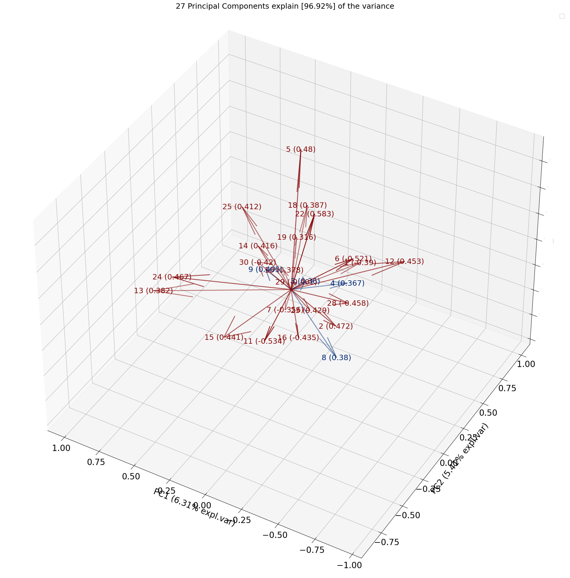
3D plots
All plots can also be created in 3D by setting the d3=True parameter.
model.biplot3d()
Toggle visible status
The visible status for can be turned on and off.
# Make plot but not visible.
fig, ax = model.biplot(visible=False)

# Set the figure again to True and show the figure.
fig.set_visible(True)
fig