Create kaplanmeier plot
In the following example we load the patient dataset and create the kaplanmeier plot, and compute the log-rank test.
# Import library
import kaplanmeier as km
# Import example data
df = km.example_data()
# Data
time_event = df['time']
censoring = df['Died']
y = df['group']
print(df)
# time Died group
# 0 485 0 1
# 1 526 1 2
# 2 588 1 2
# 3 997 0 1
# 4 426 1 1
# .. ... ... ...
# 175 183 0 1
# 176 3196 0 1
# 177 457 1 2
# 178 2100 1 1
# 179 376 0 1
#
# [180 rows x 3 columns]
# Compute Survival
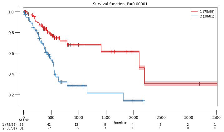
results = km.fit(time_event, censoring, y)
# Plot
km.plot(results)
|
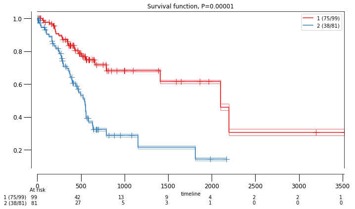
Change colormap and confidence intervals
# Plot
km.plot(results, cmap='Set1', cii_lines='dense', cii_alpha=0.05)
|
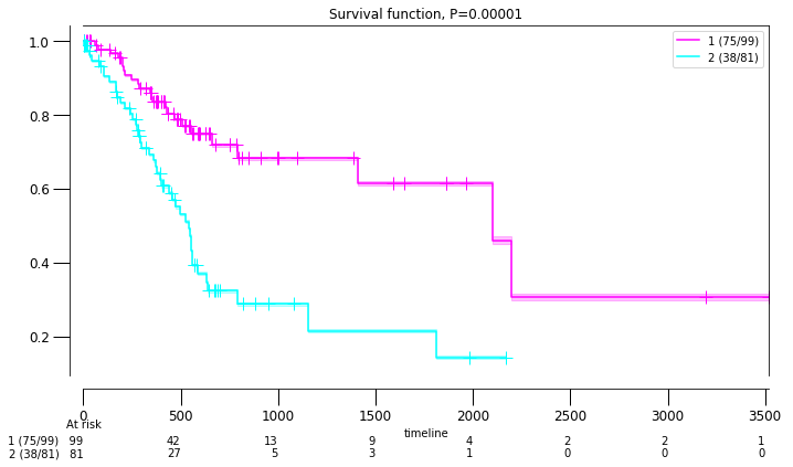
Custom colormap
# Plot
km.plot(results, cmap=[(1, 0, 1),(0, 1, 1)])
|
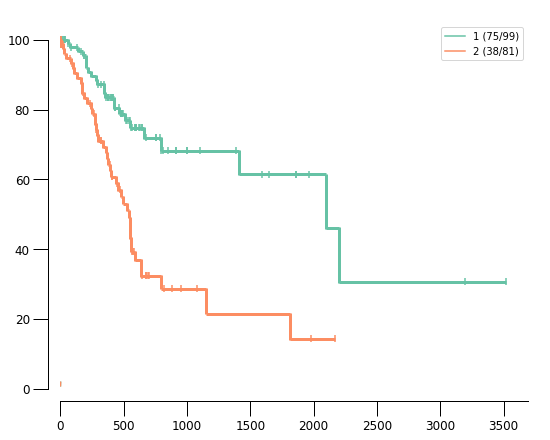
Use custom kaplanmeier method
# Plot
km.plot(results, cmap='Set2', methodtype='custom')
|
Save plot
# Save Plot
fig, ax = km.plot(results, cmap='Set2', savepath=r'c:/temp/fig1.png')
# Do not show Plot but directly save on disk
fig, ax = km.plot(results, cmap='Set2', savepath=r'c:/temp/fig1.png', visible=False)
# Increase figure resolution
fig, ax = km.plot(results, cmap='Set2', savepath=r'c:/temp/fig1.png', visible=False, dpi=300)