Network Graphs
Dynamic graph representations are created using d3blocks that allow to deeper examine the detected associations. Just like static graphs, the dynamic graph consists out of nodes and edges for which sizes and colours are adjusted accordingly.
The advantage is that d3graph is an interactive and stand-alone network. The network is created with collision and charge parameters to ensure that nodes do not overlap.
d3graph is part of the stand-alone python library (https://d3blocks.github.io/d3blocks/) which generates java script based on a set of user-defined or hnet parameters. The java script file is built on functionalities from the d3 javascript library (version 3).
pip install d3blocks
In its simplest form, the input for d3blocks is an adjacency matrix for which the elements indicate pairs of vertices are adjacent or not in the graph.
Node 1 |
Node 2 |
Node 3 |
Node 4 |
|
|---|---|---|---|---|
Node 1 |
False |
True |
True |
False |
Node 2 |
False |
False |
False |
True |
Node 3 |
False |
False |
False |
True |
Node 4 |
False |
False |
False |
False |
Static graph
from hnet import hnet
# Load example
df = hnet.import_example('sprinkler')

# Association learning
hn.association_learning(df)

# Plot static graph
G_dynamic = hn.plot()
Dynamic graph - d3blocks
from hnet import hnet
# Load example
df = hnet.import_example('sprinkler')

# Association learning
hn.association_learning(df)

# Plot dynamic graph
G_dynamic = hn.d3graph()
Each node contains a text-label, whereas the links of associated nodes can be highlighted when double clicked on the node of interest. Furthermore, each node involves a tooltip that can easily be adapted to display any of the underlying data. For deeper examination of the network, edges can be gradually broken on its weight using a slider.
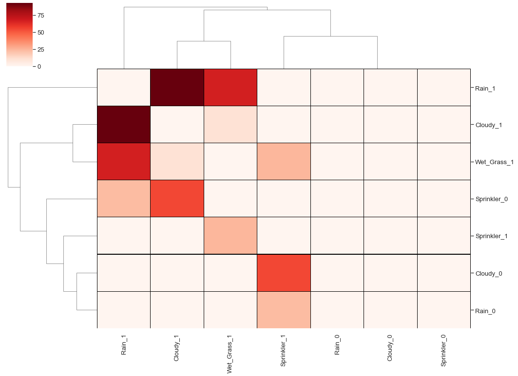
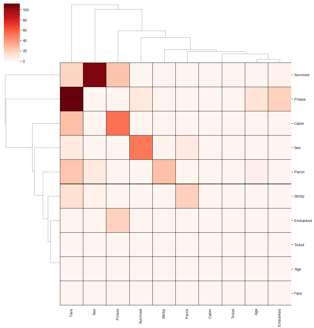
Heatmap
A heatmap can be of use when the network becomes a giant hairball. The effectiveness of a matrix diagram is heavily dependent on the order of rows and columns: if related nodes are placed closed to each other, it is easier to identify clusters and bridges. While path-following is harder in a matrix view than in a node-link diagram, matrices have other advantages. Matrix cells can also be encoded to show additional data; here color depicts clusters computed by a community-detection algorithm.
Static heatmap
Below is depicted a demonstration of plotting the results of hnet using a static heatmap:
from hnet import hnet

# Load example
df = hnet.import_example('sprinkler')

# Association learning
hn.association_learning(df)

# Plot heatmap
hn.heatmap(cluster=True)
Dynamic heatmap - d3heatmap
A heatmap can also be created using d3-javascript, where each cell ij represents an edge from vertex i to vertex j.
Here color depicts clusters computed by a community-detection algorithm. Below is depicted a demonstration of plotting the results of hnet using a d3heatmap:
# Generate the interactive heatmap
G = hn.d3heatmap()
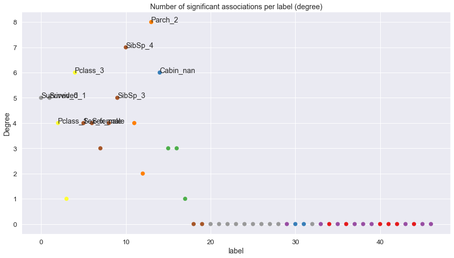
Feature importance
Feature importance can be plotted to analyze the involvement of the feature in the network.
from hnet import hnet

# Load example
df = hnet.import_example('titanic')

# Association learning
hn.association_learning(df)

# Plot heatmap
hn.plot_feat_importance()
The count of number of significance edges per node. We clearly see that Parch_2 has the most significanly connected edges. The coloring of the nodes is based on the catagory label. As an example, all Parch classes are labeled orange. Note that quantitative nodes will have low/no significant edges.
Instead of counting individual node labels (as depicted previously), we can also count the total number of edges for a specific catagory. Here we can clearly see that SibSp contains, in total, the most significant edges.
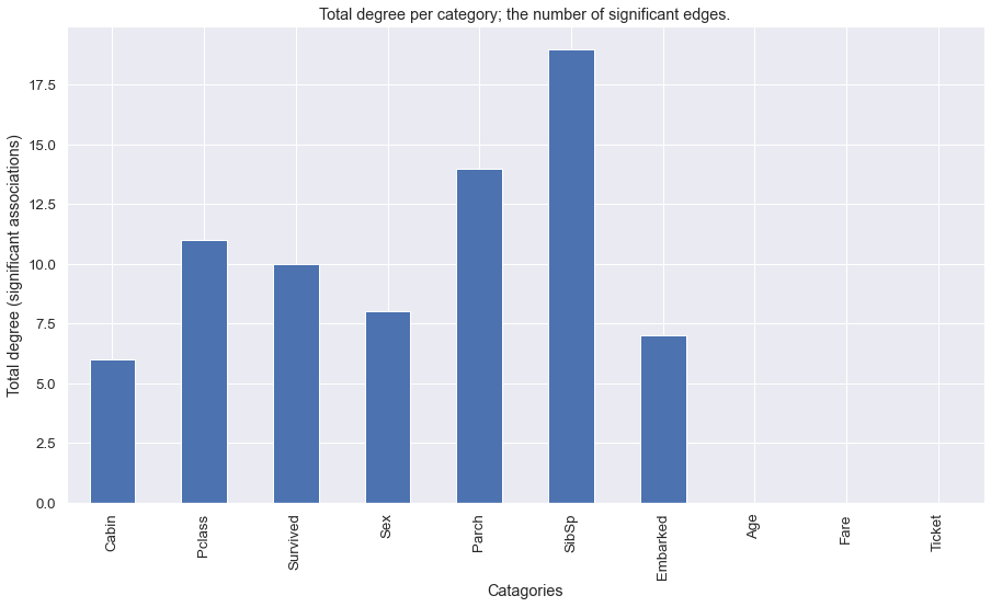
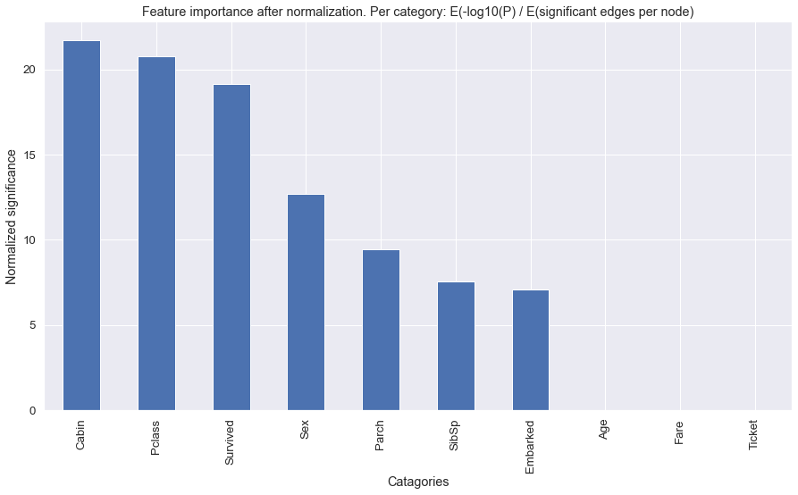
In the next figure we demonstrate the feature importance by a normalized significance. The number of significant edges in the catagory labels is heavily influenced by the available labels. As an example SibSp contains, in total, the most significant edges but this may be because it also contains the most labels. In the following figure we correct for the number of labels per catagory.
Summarize into categories
If many associations are detected, a network plot can lead to a giant hairball, and a heatmap can become unreadable.
A function in hnet is to summarize the associations towards categories. This will result in generic insights.
As an example: In case of the titanic use-case, it will not describe whether Parch 2 was associated with four SibSp
but it will describe whether Parch was significantly associated with SibSp. This is computed by using Fishers method.
from hnet import hnet

# Load example
df = hnet.import_example('titanic')

# Association learning
hn.association_learning(df)

# Plot Network
hn.d3graph(summarize=True)
hn.plot(summarize=True)

# Plot heatmap
hn.d3heatmap(summarize=True)
hn.heatmap(summarize=True)
Comparing networks
Comparison of two networks based on two adjacency matrices. Both matrices should be of equal size and of type pandas DataFrame. The columns and rows between both matrices are matched if not ordered similarly.
Below is depicted a demonstration of comparing two networks that may have been the result of hnet using different parameter settings:
import hnet

# Examine differences between models
[scores, adjmat] = hnet.compare_networks(adjmat1, adjmat2)
Black/White listing in plots
It is sometimes desired to remove variables from the plot to reduce complexity or to focus on specific associations.
Four methods of filtering are possible in hnet
black_list : Excluded nodes form the plot. The resulting plot will not contain this node(s).
white_list : Only included the listed nodes in the plot. The resulting plot will be limited to the specified node(s).
threshold : Associations (edges) are filtered based on the -log10(P) > threshold. threshold should range between 0 and maximum value of -log10(P).
min_edges : Nodes are only shown if it contains at least a minimum number of edges.
Black listing in plot
# In this example we will remove the node Age and SibSp.

# d3blocks
hn = hn.d3graph(black_list=['Age', 'SibSp'])
# Plot
hn = hn.plot(black_list=['Age', 'SibSp'])
# Heatmap
hn = hn.heatmap(black_list=['Age', 'SibSp'])
White listing in plot
# In this example we will keep only the node Survived and SibSp

# d3blocks
hn = hn.d3graph(white_list=['Survived', 'SibSp'])
# Plot
hn = hn.plot(white_list=['Survived', 'SibSp'])
# Heatmap
hn = hn.heatmap(white_list=['Survived', 'SibSp'])
White list example in plot
# In this example we will keep only the node Survived and Age

# d3blocks
hn = hn.d3graph(white_list=['Survived', 'Age', 'Pclass'])
# Plot
hn = hn.plot(white_list=['Survived', 'Age', 'Pclass'])
# Heatmap
hn = hn.heatmap(white_list=['Survived', 'Age', 'Pclass'])