Examples
This section provides comprehensive examples of using KNRscore to compare different dimensionality reduction techniques. Each example demonstrates a specific use case and includes detailed explanations of the results.
High-Dimensional Embedding Comparison: PCA vs t-SNE
In this example, we compare a 50-dimensional PCA embedding with a 2-dimensional t-SNE embedding of the MNIST dataset. This comparison helps us understand how well t-SNE preserves the structure of the high-dimensional PCA space.
# Import required libraries
from sklearn import (manifold, decomposition)
import numpy as np
import KNRscore as knrs

# Load MNIST example data
X, y = knrs.import_example()

# Create PCA embedding (50 dimensions)
X_pca_50 = decomposition.TruncatedSVD(n_components=50).fit_transform(X)

# Create t-SNE embedding (2 dimensions)
X_tsne = manifold.TSNE(n_components=2, init='pca').fit_transform(X)

# Compare embeddings
scores = knrs.compare(X_pca_50, X_tsne, n_steps=5)

# Visualize comparison
fig, ax = knrs.plot(scores, xlabel='PCA (50d)', ylabel='tSNE (2d)')
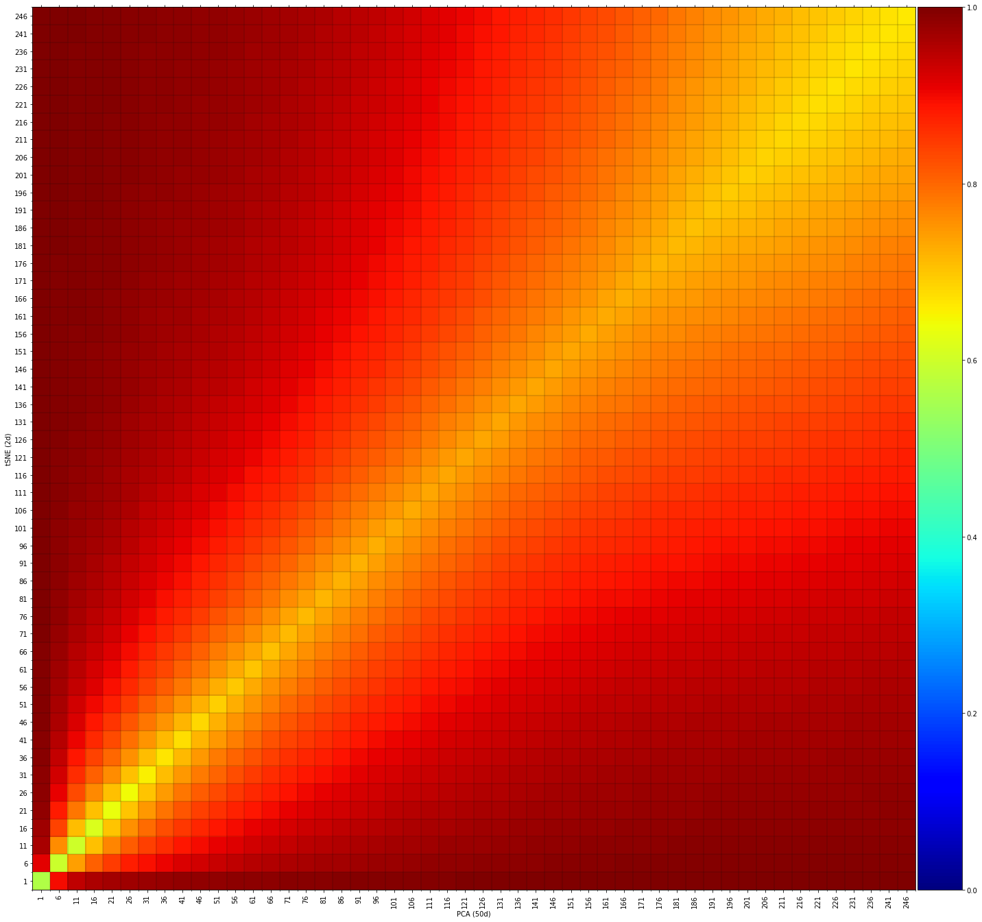
Interpretation: - The heatmap shows high similarity scores (green/yellow) across different neighborhood sizes - This indicates that t-SNE successfully preserves both local and global structures from the PCA space - The consistent high scores suggest that t-SNE maintains the relative positions of samples well
2D Embedding Comparison: PCA vs t-SNE
Here we compare two 2-dimensional embeddings to understand how different dimensionality reduction techniques represent the same data in low-dimensional space.
# Create 2D PCA embedding
X_pca_2 = decomposition.TruncatedSVD(n_components=2).fit_transform(X)

# Create 2D t-SNE embedding
X_tsne = manifold.TSNE(n_components=2, init='pca').fit_transform(X)

# Compare embeddings
scores = knrs.compare(X_pca_2, X_tsne, n_steps=5)

# Visualize comparison
fig, ax = knrs.plot(scores, xlabel='PCA (2d)', ylabel='tSNE (2d)')
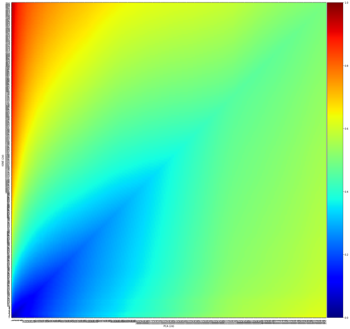
Interpretation: - Lower similarity scores (blue) indicate significant differences in local neighborhood structures - The increasing similarity at larger scales suggests that global structure is better preserved - This demonstrates how different techniques prioritize different aspects of the data structure
Random Data Comparison
This example demonstrates how KNRscore can detect completely different embeddings by comparing t-SNE with randomly permuted data.
# Create random permutation of t-SNE coordinates
X_rand = np.c_[np.random.permutation(X_tsne[:,0]),
                           np.random.permutation(X_tsne[:,1])]

# Compare random data with t-SNE
scores = knrs.compare(X_rand, X_tsne, n_steps=5)

# Visualize comparison
fig, ax = knrs.plot(scores, xlabel='Random (2d)', ylabel='tSNE (2d)')
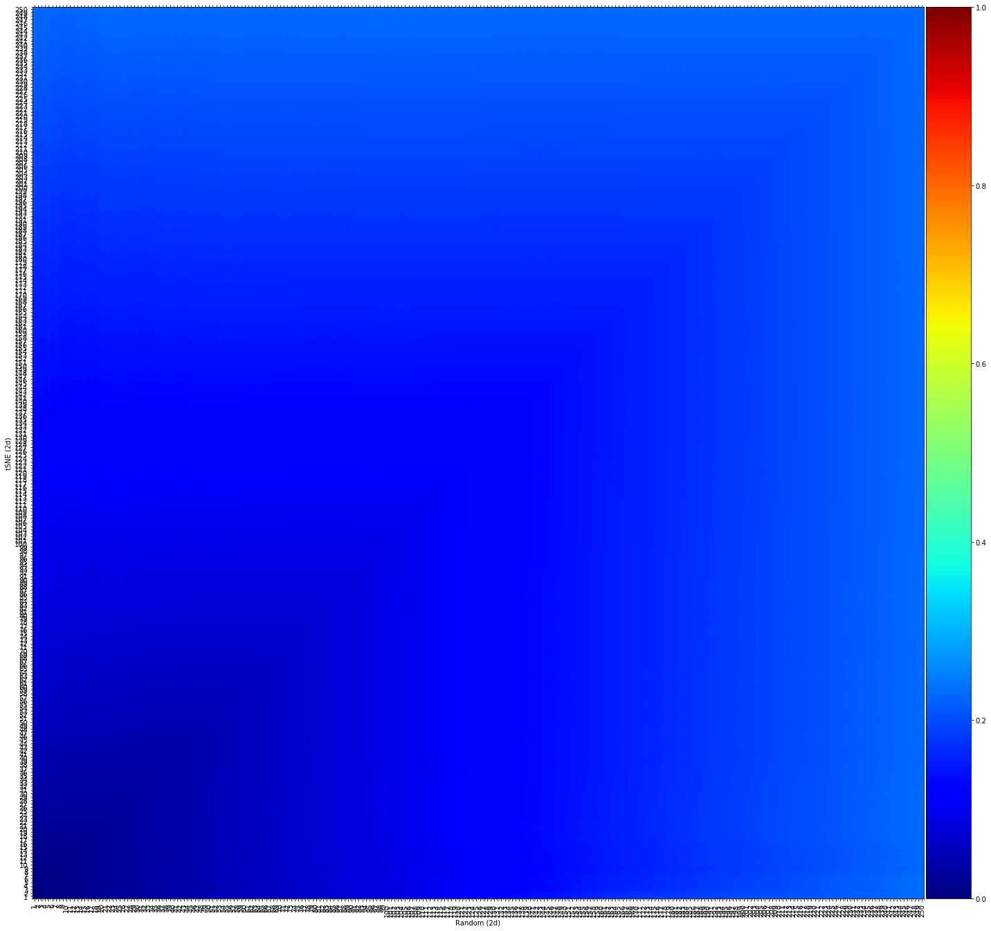
Interpretation: - Consistently low similarity scores (blue) across all scales - This confirms that random permutation destroys both local and global structure - Serves as a useful baseline for comparison with other embeddings
Visualization Examples
KNRscore also provides tools for creating scatter plots of the embeddings:
# Create scatter plot of PCA embedding
fig, ax = knrs.scatter(X_pca_2[:,0], X_pca_2[:,1],
                                          labels=y,
                                          title='PCA',
                                          density=False)

# Create scatter plot of t-SNE embedding
fig, ax = knrs.scatter(X_tsne[:,0], X_tsne[:,1],
                                          labels=y,
                                          title='tSNE')

# Create scatter plot of random data
fig, ax = knrs.scatter(X_rand[:,0], X_rand[:,1],
                                          labels=y,
                                          title='Random')
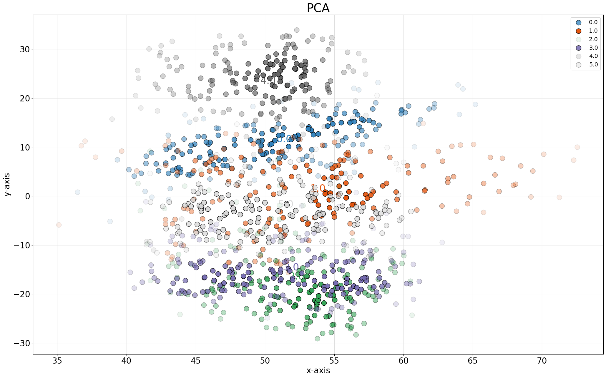
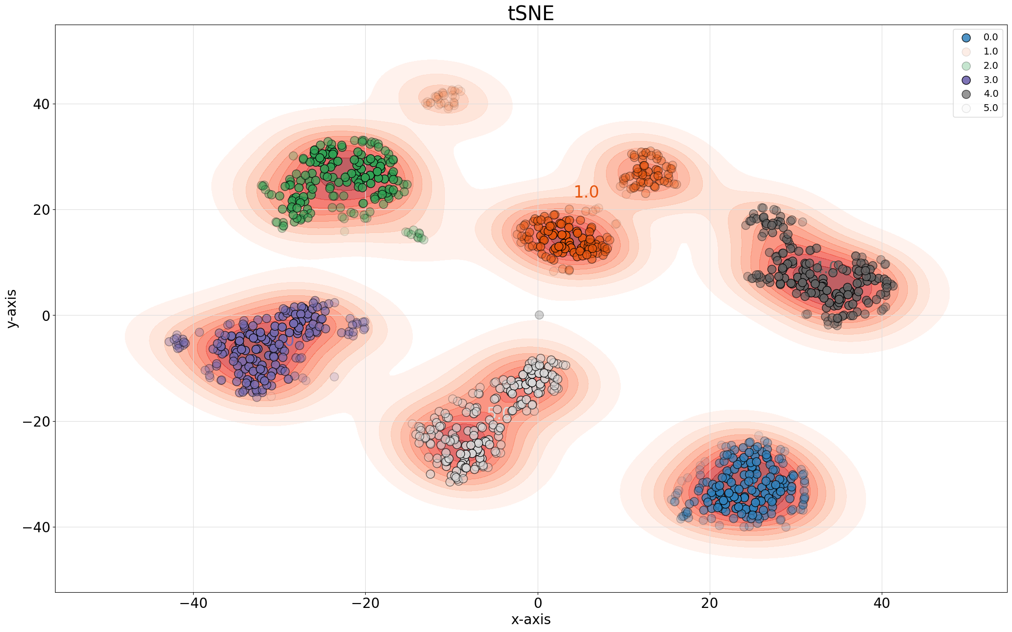
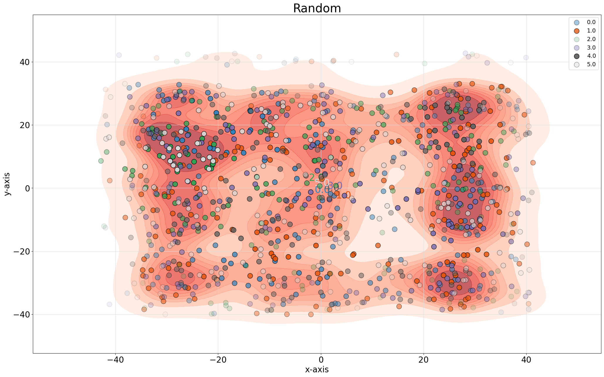
Visualization Features: - Color-coded by class labels - Optional density estimation - Customizable markers and sizes - Interactive plotting capabilities
Advanced Usage
For more advanced usage, consider:
Custom Neighborhood Sizes:
# Compare with custom neighborhood sizes
scores = knrs.compare(X_pca, X_tsne, nn=100, n_steps=10)
Multiple Comparisons:
# pip install umap-learn
import umap

# Create PCA embedding (50 dimensions)
X_pca = decomposition.TruncatedSVD(n_components=50).fit_transform(X)
# Create t-SNE embedding (2 dimensions)
X_tsne = manifold.TSNE(n_components=2, init='pca').fit_transform(X)
# Create UMAP embedding (2 dimensions)
X_umap = umap.UMAP(n_components=2).fit_transform(X)

    # Compare multiple embeddings
    embeddings = {
            'PCA': X_pca,
            'tSNE': X_tsne,
            'UMAP': X_umap,
            }

    for name1, emb1 in embeddings.items():
            for name2, emb2 in embeddings.items():
                    if name1 < name2:
                            scores = knrs.compare(emb1, emb2)
                            knrs.plot(scores, xlabel=name1, ylabel=name2)
Parameter Optimization:
    # Find optimal t-SNE parameters
    perplexities = [5, 30, 50, 100]
    for p in perplexities:
            X_tsne = manifold.TSNE(perplexity=p).fit_transform(X)
            scores = knrs.compare(X_pca, X_tsne, n_steps=10)
            # Higher score is better
            print(f"Perplexity {p}: {np.mean(scores['scores']):.3f}")

# Higher score is better
# 100%|██████████| 50/50 [01:47<00:00,  2.15s/it]
# Perplexity 5: 0.844
# 100%|██████████| 50/50 [01:33<00:00,  1.88s/it]
# Perplexity 30: 0.877
# 100%|██████████| 50/50 [01:31<00:00,  1.82s/it]
# Perplexity 50: 0.885
# 100%|██████████| 50/50 [01:17<00:00,  1.55s/it]
# Perplexity 100: 0.889